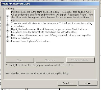
It seems it can never be underestimated the importants of clearing out as many of the Warnings in Revit as possible. It will accomplish several things and avoid the following problems:
- A low number of warnings will keep your file size small relative to the building size.
- Less errors means reduced computer processing and quicker completion of tasks (i.e. your model is less clunky).
- Elements with warnings associated to them; don’t always behave correctly, be that graphically or how they interact with other elements. Removing the warnings removes this.
- Accuracy of Schedules. No warnings ensure you have no duplicate objects or doubling of Mark numbering.
- Some errors can cause elements not to join to other elements or inability to dimension then.
Going down though the Review Warnings is not an easy task. It takes a lot of in-depth knowledge of how categories, families and elements act. In Revit 2008 there was only two ways of resolving them.
First is fixing it when the error first happens and the warning box comes up. With the amount of clicking users do they have often passed it, before they have even seen it. Out of sight is out of mind. Right! If they did see it flash past, how do they go back to see what it is?
Second is to go to the Review warnings section under Tools. Here you end up with sometimes a very large list. Where do you start to resolve them? How do you resolve them? If you try to view the elements in question, often you can’t see them. Most of the time the only options it gives you it to delete the object. That doesn’t seem to be a solution.
With Revit 2009 there were some improvements in regard to assisting users sort through their warnings. I’ll come to that next post, but let’s address some of the above first.
The first item is the warnings in the first place.
So you are to click happy and you missed the warning message. Don’t ignore it. Go to the undo dropdown icon. If you have just finished a sketch you can undo the finish sketch. If you then click finish sketch you will get the ability to view the warning. In the event you were moving or dragging an element, undo what you just did and redo it. Anticipate the message and heed the warning.
Some other warning errors;
“Highlighted walls are attached to, but miss, the highlighted targets.” You can select Detach Targets or OK. Clicking OK does not resolve the problem. Detaching the target resolves it.
“A structural framing element is attached to a wall whose Structural Usage is set to Non-bearing.” You can Make the wall load baring or click OK. Again OK won’t resolve the problem. Either make the wall load baring or drag the structural framing off the wall.
“Multiple Rooms are in the same enclosed region. The correct area and perimeter will be assigned to one Room and the others will display "Redundant Room." You should separate the regions, delete the extra Rooms, or move them into different regions.” You can click Delete or OK. Again OK won’t resolve the problem. Either you delete the room or subdivide the bigger room into two.
We could go on, but you get the picture.
Going down through the Review warning.
When you are using the show tool in review warnings, if you don’t see any highlighted elements in the view, change the view to wire frame. It’s likely you will see the item.
The highlighted items themselves.
In the review warning if you click on the “Warning” it will highlight it in the dialog box. This also highlights both elements that are causing the problem. Expanding out the warning and clicking on one of the elements will highlight that specific element in the view. Clicking on the other element in the review warnings will obviously highlight the other element. This can greatly assist you in understanding the elements in question. Only tick the box beside the element if you want to delete or unjoin the element.
More on this topic in the next post.


No comments:
Post a Comment